Browsing for Dissonance: Paratexts, Box-Art Iconography, and Genre
by Kevin M. Flanagan
[ PDF version ] This essay is about the ways in which conceptualizations of film genre are informed by the browsable, display-based nature of the video store. It attempts to examine the visual strategies used for the cover art of VHS and DVD boxes in relation to the space of the video store. The appearance of feature films both on television and on home video positioned moving image exhibition as a largely home-centered activity, effectively changing the avenues by which viewers encountered, negotiated, and consumed a text.[i] In the United States, the video store came to be the primary place to access a diverse selection of movies for home viewing, serving as a kind of commercial archive that potentially housed a whole history of film styles, national traditions, and genres. The reductive organizational strategies of chain stores such as Blockbuster Video and Hollywood Video meant that movies with very different genre credentials—“mainstream” and “cult” alike—often ended up next to one another on shelves. One of the strange affective registers of the video store is, therefore, the cognitive dissonance associated with the organizational simplification of the product on display: the odd reality of arbitrarily encountering the existential road movie Two-Lane Blacktop (dir. Monte Hellman, 1971) next to a recording of a demolition derby (because they both feature cars), or the problematic fact of seeing a DVD of the White/middle class coming of age drama The Wackness (dir. Jonathan Levine, 2007) next to a DVD of the foundational hip-hop feature Wild Style (dir. Charles Ahearn, 1983) by virtue of their mutual use of graffiti typography for the film title. Exterior similarity does not necessarily signal genre kinship.


While movies have always been advertised through extra-textual visuals—posters, stills in magazines, newspaper ads—the video cassette, as both container of film text and artifact in its own right, complicated the means by which a film’s images circulated in public. In chronicling the rise of the VCR, Joshua Greenberg notes that, simultaneous to the rise of the video store, “videotapes themselves became understood less in terms of their technical nature as interchangeable parts of the VCR and increasingly in terms of the texts that they carried.”[ii] Jonathan Gray's recent work on paratextuality—provisionally, “texts that prepare us for other texts”—provides a further means by which to frame how the VHS or DVD box serves to prefigure the generic positioning and received meanings of a moving image text.[iii] Following literary scholar Gerald Gennette, Gray asserts that one potential feature of a media paratext is that “many of these items are filters through which we must pass on our way to the film or program,” and that these paratexts in fact provide “our first formative encounters with the text.”[iv] Ideally, the paratextual frame for the principle moving image text (though Gray finds this differentiation to be problematic) forges a productively correspondent aide to recognition and usefulness of consumption.[v]
Of course, the relationship between primary moving image text and paratext is seldom without problems. In explaining the habitus of the video store, Greenberg writes:
In the video store, customers browsed movies, represented by boxes containing nothing more tangible than the experience of watching a movie itself. The boxes, usually featuring still images as well as a short description of the movie or other content, served as place holders—signifiers referring not to a specific cassette, but to the idealized text encoded therein.[vi]
In a similar vein, VHS box art aficionado Jacques Boyreau notes that “posters could advertise, slightly fetishize a movie; credit sequences could identify participants; but with conspicuous street cred and hustler-friendly mercantilism, VHS box-art ‘became’ the iconic equivalent of the movie.”[vii] There is a felt connection between the moving image text’s genre(s) and the genre(s) suggested by its paratextual frame. The video store itself facilitates a display of movie paratexts, and provides a means of ordering them into provisional categories.
I am deliberately limiting my definitional field for “film genre,” for the sake of manageable argument. While Rick Altman and a host of others have explored the expansive factors contributing to the scope of what helps constitute a genre—the industrial contexts, the claims of filmmakers and studios, the consumptive responses of fans, the retrospective sorts of organizational analysis enacted by film historians—I am mainly interested in how VHS/DVD box art (a specific kind of gateway paratext) complicates the obvious, broad-based sense of genre and its relation to specific iconographic elements.[viii] For my purposes here, a rather safe and surprisingly unprovocative claim from Altman's Film/Genre encapsulates some of the basic assumptions: “in order to be recognized as a genre, films must have both a common topic ... and a common structure, a common way of configuring that topic.”[ix]
But a common topic—aliens, cars, the trials of growing up—may not be enough. Similar narratives, repetitive resolutions, and a general sense of predictability further solidify an individual’s associational genre map.[x] Stephen Neale writes that individual movies, even when derivative, are regarded as “more or less distinct from one another,” meaning that successful templates are important to the film industry:
genres provide a cost-effective equivalent to lines and ranges, producing a demand for similarities within the variety of product on offer and therefore minimizing the degree of difference involved. Within and across the array of its output, Hollywood’s product is therefore always diverse—each of its films are always new, each of its genres always different from one another. But within its ranges and models, within its genres, its films are also always similar.[xi]
Paratextual frames may just as easily add to this continuous process of genre delineation as obscure it. Given the complexity of this triangular relationship between the organizational logic of the video store, the iconographic elements featured on a film’s box, and the actual generic elements that come to be constituted through a productive viewing of the moving image text as it plays, I will hereafter limit myself to remarks on the types of flattening or simplification that results from the specific practices of these video publishers.
It is no coincidence that video stores thrived throughout 1980s, concomitant with the American film industry’s full-force embrace of what are called “high concept” marketing strategies. Roughly beginning with the blockbuster promotional campaign behind Universal's film Jaws (dir. Steven Spielberg, 1975), a “high concept” film is an easily graspable, iconographically memorable movie branded (through consistent marketing and ancillary licensing) for maximum success.[xii] These films can easily be condensed to core elements, or as Wasser notes “toward quick recognition in order to facilitate not only movie attendance but also sales of all commodities associated with the film, from record albums to toys to home video.”[xiii]
Films on video cassette and DVD, be they unapologetically “high concept” fare or extremely complex and convoluted cult films, were heirs to the logic of this mode of marketing.[xiv] General characteristics of video box-art are designed to convey a whole series of associations with simple component parts such as color, font, and design. Some of these formal characteristics are readily understood after one visit to a video store: horror films are often sold via black and red color schemes, sometimes with text that approximates the look of dripping blood.

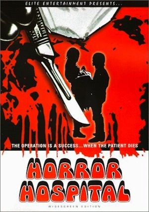
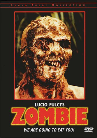

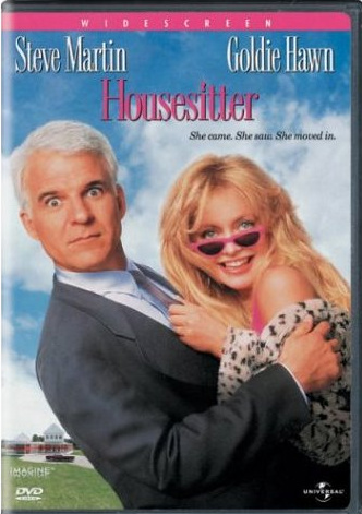
Romantic comedies, which often orbit around relationship issues, coupling, and the marriage plot, tend to prominently feature pink and blue color schemes, which suggest shorthand significations of officialized femininity and masculinity.



The Western, an extremely iconographically anchored genre, is often sold through recurrent objects (hat, gun, horse), environments (desert, expansive horizons), fonts (made to simulate the branding iron, or weathered wooden boards), and dominant colors (browns and blues, whose alternation connotes the interplay of sky and sand).[xv] These visual cues often merge with metonymic images, like facial portraits of a given film’s lead actors, to ensure that a set of expectations about a film are in place before the movie is even screened. Thus, video/DVD box-art serves to generally support one of the main functions of the video store: a place to facilitate choice between an apparently diverse selection of “experiences to be rented,” which come to be artificially contrasted, or sometimes illogically made similar, by virtue of their visual marketing.[xvi]
But branding and genre typification, as I have noted, are not limited to highly visible Hollywood genres. Films positioned by fans and marketers as “cult classics”—a term that the editors of the anthology Defining Cult Movies: The Cultural Politics of Oppositional Taste take care to qualify as produced through circulation and consumption, usually underpinned by a vaguely “subcultural ideology” and some sort of dissatisfaction with mainstream movie production—should, logically, work against the tendency to flatten and simplify genre.[xvii] After all, these films generally revel in hybridity and eclecticism. However, two examples (from among many possible)—MGM's branded line of “Midnite Movies,” and American Nightmares (Troma video title: Combat Shock [dir. Buddy Giovinazzo, 1984])—illustrate the degree to which the forms of visual shorthand demanded by video stores and the display-based sale of VHS and DVD product attempts to reign in the unruliness of films defined by their strange subjects, aggressively sensationalist tones, and inherently mixed generic sensibilities. Even complicated films are not immune to the visual demands of the video box.
Although the publishing rights to the MGM library of titles constantly changes hands, the Midnite Movies line of VHS and DVD releases was consistently branded from its initial debut in 2001 until its demise in 2007. It began as an outlet for MGM, which had acquired Orion Pictures, to release Orion’s vast back catalog of American Independent Pictures titles from the 1950s and 1960s.[xviii] It expanded to include releases originally produced for Hammer, Orion, and United Artists, amongst others. Midnite Movies to date include 1960s beach party flicks like Beach Blanket Bingo (dir. William Asher, 1965); swashbuckling adventure films aimed at adolescent audiences such as The Boy and the Pirates (dir. Bert I. Gordon, 1960); biker movies such as The Wild Angels (dir. Roger Corman, 1966); 1980s science-fiction/horror movies like The Beast Within (dir. Philippe Mora, 1982) and Strange Behavior (dir. Michael Laughlin, 1981); and horrific literary adaptations like The Tomb of the Ligeia (dir. Corman, 1964).
The term “midnight movies” references a diverse group of films that garnered dedicated viewing cults through repeat nighttime screenings such as El Topo (dir. Alejandro Jodorowsky, 1971), Night of the Living Dead (dir. George A. Romero, 1968), The Rocky Horror Picture Show (dir. Jim Sharman, 1975), and Eraserhead (dir. David Lynch, 1977).[xix] These original midnight movies were noteworthy for their success despite poor or sometimes non-existent formal marketing campaigns, notoriously unclassifiable genre credentials, and for their popularization via communal audience interests. Their reputations were the result of the shared experience, and in some cases direct participation, of the packed bodies in a public movie theater.
The Midnite Movies line packaged film for home and private consumption, used consistent graphic design to insist on unstated similarity, and attempted to preemptively predict audience tastes by wrangling dissimilar films under its auspices. Midnite Movies are primarily identified by the sinister-looking band on top of the front cover image, which displayed the line’s name in uniformly blue font.


Each back cover includes the standard text explaining plot, complemented by a series of movie buff “Fun Facts” about the film’s initial production or reception. The brand, paradoxically, brings the high-concept homogenization desired by tidy Hollywood product to the most diverse, unexplainable, and loosely aligned set of films. It re-orients the public, ritualistic, and grassroots aspects of the “midnight movie” phenomenon for the individual collector, and in the process suggests artificial or superficial similarities between films made by different companies, under a varied set of production circumstances. While the Midnite Movies line may strive to connote wacky cult credentials and prepackaged B-movie sensibilities, it perhaps inadvertently signals a nostalgia for a past regime of moviegoing (the “midnight movie” experience, accessible to young, urban audiences throughout the 1970s) that can masterfully be hinted at, indeed imperfectly approximated, by the video store, yet not be sufficiently encapsulated in home viewing.
If the Midnite Movies line shows how the nature of the video store can problematize the accurate portrayal of a whole group of movies, then the case of American Nightmares specifically shows how an original, singular film can be manipulated to fit the current stipulations of the home video market. American Nightmares was an independent production filmed in 1984, “shot guerilla-style with a meager budget and bare-bones crew,” that followed a typically suicidal day in the life of nominal protagonist Frankie Dunlan (Ricky Giovinazzo), “a psychologically unstable Vietnam vet with a heinous secret, a deformed child, a shrieking wife, and holes in his sneakers,” as he trudges about decaying Staten Island in search of money, employment, and piece of mind.[xx] Despite its stark, gritty look that differentiated it from nearly all other contemporary films of urban decay—its closest kin in that regard are films like Vigilante (dir. William Lustig, 1983) and Street Trash (dir. J. Michael Muro, 1987)—aspects of its narrative resemble known hits like Taxi Driver (dir. Martin Scorsese, 1975: returned, alienated Vietnam vet haunting grimy New York) and Eraserhead (strange, inexplicably deformed child as fantastical center of unstable marital relationship). However, despite its coherent similarities to other production trends and contemporary genres, the film is regarded as darkly visionary for its unflinching look at hopelessness, its violently suicidal protagonist, and its focus on characters that each seem to be beset by one existential crisis or another. As originally produced, American Nightmares could have been sold to niche audiences on its bleak, unforgiving worldview.
Instead, American Nightmares was released on video as Combat Shock by Troma Entertainment—a company as well known for its original productions (The Toxic Avenger [dir. Lloyd Kaufman and Michael Herz, 1984]) as for the low-budget features it picked up for theatrical and video distribution.

As a self-styled exploitation label in the tradition of AIP, Troma’s films were accompanied by ballyhoo visuals. The opening sequence of Combat Shock follows Frankie and his fellow troops during a particularly psychologically damaging episode in Vietnam. While intending to set up Frankie's mental state as manifest in the rest of the film, it is nonetheless a short sequence in relation to the rest of the film. Troma seized these images for its VHS release—a soldier in military fatigues, helicopters, Vietnamese prisoners—with recognizable city images (the skyline, two men engaged in a knife fight) constituting less than one third of the image. The film was, in effect, being marketed as one in a series of “back to Vietnam” films such as Missing in Action (dir. Joseph Zito, 1984), Missing in Action II: The Beginning (dir. Lance Hool, 1985), and Rambo: First Blood Part II (dir. George P. Cosmatos, 1985). In a bid at placing a complex independent film into a recognizable high-concept framework, this film’s emphasis on crumbling relationships, existential introspection, and alienation were jettisoned as unimportant.
If Troma’s 1980s VHS made a somewhat dishonest attempt at making Combat Shock attractive to video store audiences, their 2009 DVD re-release took the opposite approach, in the process appealing to a collectors market less concerned with the display-based browsing, and more attuned to the minimalistic, dignified presentational style of prestige labels like The Criterion Collection.
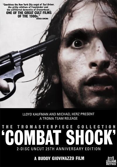
The film was among the first released through Troma’s branded “Tromasterpiece Collection” sub-label. The Rambo-esque, action film pedigree suggested by the old box art was gone. Instead, the film was finally afforded a stark, striking, confrontational cover image befitting the dark, generally subdued tone of the film. Ricky Giovinazzo-as-Frankie stares directly out of the frame, eyes ablaze, with a revolver pointing at his head in anticipation of the film’s downbeat finale. Combat Shock/American Nightmares was no longer positioned to entice potential renters. It was pitched at audiences already familiar with its stark uniqueness. With the video store an effectively dead cultural institution by 2009, the film could honestly be marketed to its already-converted niche audience.
Box art images, among the most inescapable of movie paratexts, have tended to flatten or simply film genres. High-concept marketing, combined with an intensified tendency toward branding and corporate logos, meant that movies on video were bound to espouse highly recurrent patterns. Although cover art continues to be attached to movies—it remains a key part of the browse function of Amazon.com, Netflix, and other digital shopping interfaces—its function as an iconographically profuse signal for genre was an almost inescapable anchor of meaning during the golden age of the retail video store.
Notes
[i] See Frederick Wasser, Veni, Vidi, Video: The Hollywood Empire and the VCR (Austin: University of Texas Press, 2001), 118.
[ii] Joshua M. Greenberg, From Betamax to Blockbuster: Video Stores and the Invention of Movies on Video (Cambridge, MA: The MIT Press, 2008), 42.
[iii] Jonathan Gray, Show Sold Separately: Promos, Spoilers, and Other Media Paratexts (New York: New York University Press, 2010), 24.
[iv] Gray, Show Sold Separately, 3. Gray works extensively out of a framework established by Gerald Genette, Paratexts: The Threshold of Interpretation, trans. Jane E. Lewin (Cambridge: Cambridge University Press, 1997).
[v] Gray, Show Sold Separately, 30-31. Here, Gray draws on the work of Roland Barthes to assert that the true, that is, productive, work of the text is only unlocked or actualized in the act of consumption. Past experience, context, and other contingent frames are as meaningful as that which is objectively on the page or screen.
[vi] Ibid., 86-87.
[vii] Jacques Boyreau, Portable Grindhouse: The Lost Art of the VHS Box (Seattle, WA: Fantagraphics Books, 2009), 7.
[viii] See Rick Altman's influential text Film/Genre (London: British Film Institute, 1999). For a broad overview of film genres, consult Barry Keith Grant, Film Genre: From Iconography to Ideology (London: Wallflower Press, 2007).
[ix] Altman, Film/Genre, 23.
[x] Ibid., 25.
[xi] Steve Neale, Genre and Hollywood (New York: Routledge, 2000), 231.
[xii] Wasser, Veni, Vidi, Video, 161.
[xiii] Ibid. Italics mine. Gray has an analogous concept in his description of “speculative consumption,” which he explains to be the process by which one predicts what pleasures, ideas, and sensations a text will deliver, in part as a practical way to save time and fulfill a fixed set of expectations based on taste and mood. Gray, Show Sold Separately, 24.
[xiv] The logic of homogenized representation need not be the only way. Famously, Polish film posters produced under communism utilized abstract or surreal imagery in advertising conventional American films. See George Webster, “Remaking Hollywood: The Strange World of Polish Film Posters,” CNN Entertainment, July 6, 2010, accessed September 20, 2010, http://articles.cnn.com/2010-07-06/entertainment/polish.film.posters_1_posters-role-in-polish-society-unusual-charm.
[xv] An early discussion of iconography in genre films is found in Colin McArthur, Underworld USA (London: Secker and Warburg, 1972), 23. For an expanded, general discussion of iconography and genre identity, see Neale, Genre and Hollywood, 13-16. For a discussion of icons specific to the Western, see Will Wright, Six-Guns and Society: A Structural Study of the Western (Berkeley: University of California Press, 1975).
[xvi] The conceptualization of a video store as a place which saw cassettes as “experiences to be rented” is traced back to The Video Station, a pioneering rental store from the late 1970s. Greenberg, From Betamax to Blockbuster, 68.
[xvii] Mark Jancovich et al, “Introduction,” Defining Cult Movies: The Cultural Politics of Oppositional Taste (Manchester, UK: Manchester University Press, 2003), 1.
[xviii] Thomas K. Arnold, “Before the A-films arrive, 'psych-out' with a good B-movie,” USA Today April 27, 2003, accessed August 12, 2010, http://www.usatoday.com/life/movies/news/2003-04-27-schlock_x.htm.
[xix] The phenomenon is discussed in J. Hoberman and Jonathan Rosenbaum, Midnight Movies (New York: Da Capo, 1983).
[xx] “Blood on the Floor: Buddy Giovinazzo,” Midnight Mavericks: Reports from the Underground, ed. Gene Gregorits (Surrey, UK: FAB Press, 2007), 171.
Kevin M. Flanagan is a Ph.D. student in the Critical & Cultural Studies Program at University of Pittsburgh. He is editor of Ken Russell: Re-Viewing England’s Last Mannerist (Scarecrow Press, 2009).
 Post a Comment